Logo redesigns: Why are brands becoming more minimalist?

By Georgia Robertson

A lot of brands recently have been actioning logo redesigns and branding and are adopting a much more minimalist approach. This seems to be a common trend within the graphic design industry in recent times. 

Traditionally, what’s thought of as a ‘good’ logo, is one with detail and design embellishment. Big companies previously would pay big money to make sure that their logos were crafted with detail and intricacy, and this is what was considered ‘strong’. Brands have now however started to deviate from this approach.

A brief history

The history of brands date way back to ancient family crests, and hieroglyphs. Early logos were developed for shops as signage to represent what they did. More modern logos were developed in the early 1900s, in the industrial era, alongside mass printing.

1956 saw a huge turn around in the development of logos, with Paul Rand’s IBM logo design at the forefront. This started the wave of businesses recognising logos for what they could be: an impactful symbol to represent exactly what the company stands for to brand a business.

Memorability

It’s no secret that logos need to be recognisable and eye-catching. But how can brands achieve memorability? Arguably, one of the most important aspects of any brand is a strong colour palette. The colours should be used consistently across all mediums, whether it’s across print collateral or digital. Colour use should not be too complicated, and you should try not to use too many colours. Logos should be simple enough for a consumer to easily digest and the most successful logos have a limited colour palette.

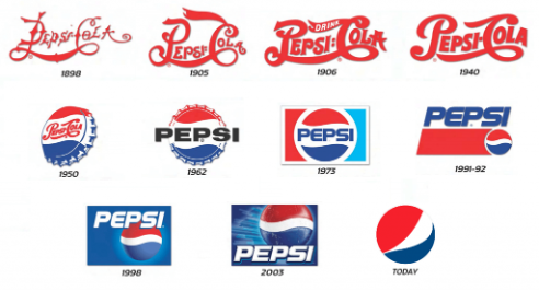
An example of a brand that has recently stripped back their logo to be much more simplistic is Pepsi. This is a brand that has been around since the late 1800’s and has been through a lot of different logo variations. The last logo is arguably the most recognisable, despite being the simplest.

pepsi

A new design for a new era

Is technology really taking over the world? Well, it’s certainly taking over the consumer industry. As technology has been advancing over the last decade, many things are becoming more digitized. Brands are embracing it and putting everything on the web. Nearly every brand these days has at least a website, and most use social media.

In the pre-digital era, most avenues that brands explored to market themselves involved traditional methods, like TV adverts and billboards. Today, everything is available at the click of a button. So, it’s important for brands to embrace social media and the new technological era. However, there are so many different devices out there, with different ratios and dimensions. So, responsiveness is a key consideration.

A lot of content can be available to a consumer through technology, and digital platforms can have a lot of content to digest on its interfaces. Having an over-complicated logo could potentially overwhelm the consumer. Before, brands would not have this issue as there were limited places that the average consumer would be able to engage with brand content. Social media and the digital age has reversed this, with users able to visit a website or social media platform in a matter of seconds. Stripping a logo back can let the user focus on the content. And chances are, if the average consumer is on your website, they probably aren’t much attention to the amount of detail in your logo anyway!

Consumer behaviour

Believe it or not, psychology can play a role in how successful a brand is. All colours, shapes and styles have connotations that people associate with different things. For example, red can have connotations with anger or fire or passion, while blue can have connotations of calmness or peace. The colours and shapes a brand uses plays a part in how its consumers view it and what they associate it with. Using too many colours and adding too much detail, as many brands used to do primarily before the digital era, can confuse consumers.

Conclusion

Are these logo redesigns just a trend that is bound to change with time, just as fashion trends change? Not if it is done well. The idea of a great logo is to be timeless and easily interpretable. Many previous logos didn’t meet this goal, and used 3D techniques, as well as over-detailing. These techniques made the logos hard to print and could verge on being forgettable as they’re not as striking and memorable.

Graphic designer, Sagi Haviv, has designed some of the most iconic logos around, such as National Geographic, PBS, and Mobil. He claims that a logo should be three things to be successful: appropriate, distinctive and memorable and simple. Logos need to be able to be viewed across multiple different mediums and platforms, and needs to be adaptable to this.