5 Creative trends we expect in 2026

Author: Ollie Noble

Alright, pop quiz. What’s going to separate the brands that soar in 2026 from the ones that get skipped faster than a YouTube ad?

It’s not just “working harder” (though we’re big fans of that). It’s about looking like you belong in the future, not stuck in a 2024 time loop.

Here at Zap, we don’t have a crystal ball. But we do have a team of 12 obsessive creatives sitting in one office, shouting ideas across desks and drinking enough caffeine to kill a small horse. We’ve been watching the landscape, and let us tell you: Beige is dead. Boring is illegal. And static is basically invisible.

If you’re an ambitious business looking to move fast this year, here are the top 5 design trends you need to know about—and exactly how to use them without looking like you’re trying too hard.

1. Chaos Packaging

(Maximalism Is Back)

Remember when every brand looked like a minimalistic vitamin bottle? White space, sans-serif font, zero personality? Yeah, we’re bored of it too.

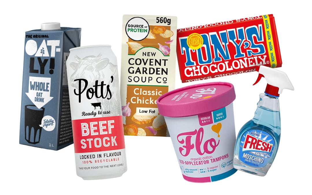
2026 is the year of “Chaos Packaging.” We’re talking clashing colours, dense layers, and designs that scream from the shelf (or the Amazon thumbnail). It’s about “visual storytelling” hiding little jokes or “Easter eggs” in the design that reward people for paying attention. Tony’s Chocolonely is a great example for all the above! Bold, striking, clashing colours; a true and meaningful story which is represented throughout the product in easter egg fashion such as the uneven divisions in the chocolate bars makeup – not only unusual but furthers the story of their cause to reduce the unfairness in the cocoa trade. Oatly have also been pumping out easter eggs with the content on the side of their cartons, so much so they’ve put together a web page counter just for those curious enough to search it up.

Chaos packaging can also relate to the form of the product. Soup in a carton (Covent Garden Soup Co), or beef stock in a can (Potts) are simple form switch ups that have created stand out products within competitive fields. Taking this a step further you can think of links between different products when it comes to consumption like tampons in an ice cream tub (Flo); or the juxtaposition of a high-end perfume in a household cleaning spray bottle (MOSCHINO). These products stick in the mind like that TV ad with the annoying jingle, one quick search of ‘stock in a can’ and you’ll only be finding one result – solid marketing play.

How to use it:

Don’t be afraid of clutter, provided it’s curated clutter. Ask us to dial up the colours, textures and typography. If your product looks like it could start a party, you’re doing it right. Tell us all the brand details, what’s the story, the cause, why are you different? We’ll help you find those easter egg moments and connect your personality and story to the consumer. Question the norms in your sector, if everyone is using cans, maybe it’s time to consider a carton.

maximalist packaging design 2026

2. Retro-Futurism 2.0

(The Y3K Vibe)

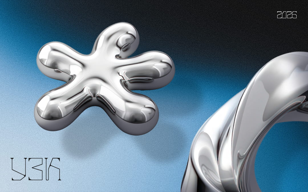
Imagine if a 1960s sci-fi writer tried to predict the internet. That’s the vibe. We’re seeing a massive resurgence of grainy, analog textures smashed together with neon gradients and chrome effects.

It’s nostalgic enough to feel safe, but weird enough to feel cutting-edge. It creates a sense of “tech optimism” that feels very refreshing right now.

How to use it:

This is perfect for tech startups or service brands who want to look established but innovative. Swap that flat blue background for a grainy gradient or a metallic 3D render.

y3k-vibe

3. Human Made Imperfection

(Irregular By Nature)

Let’s address the elephant (or the robot) in the room: AI. As the internet gets flooded with slick, perfect, AI-generated images, human eyes are craving the “oops” factor.

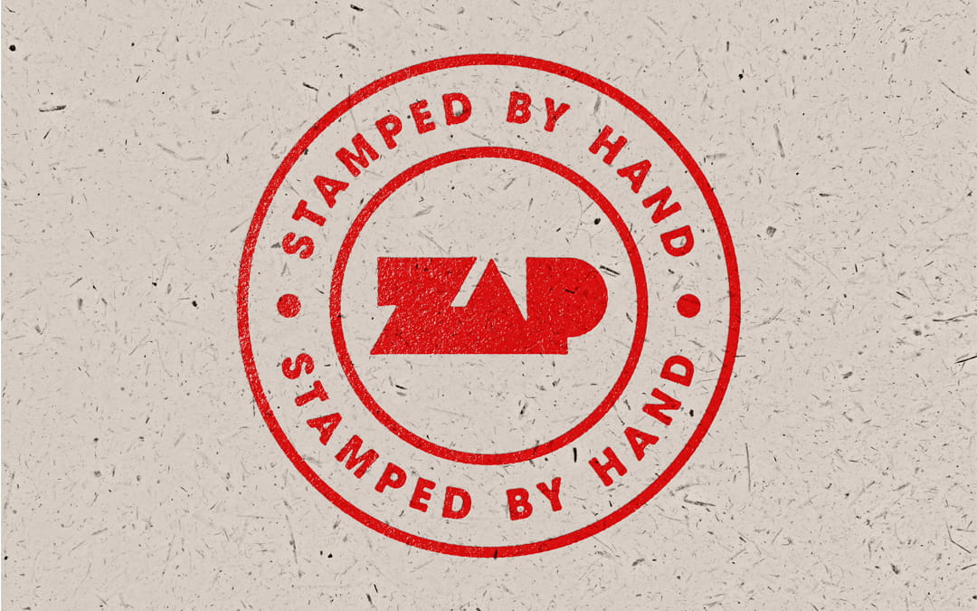
We’re seeing a premium placed on things that look… well, handmade. Visible brush strokes, hand-drawn scribbles, slightly wonky typography, and raw photography. It sends a subconscious signal: “A real human actually sweated over this.”

Common themes here include printing techniques that are traditionally hand crafted. Screen printing, linocut, and letterpress for example are all techniques that have distinct characteristics creating small imperfections displaying physical truth:

  • Variability instead of replication

  • Texture instead of smoothness

  • Process visible in the outcome

  • Human decisions frozen in ink

How to use it:

Ditch the stock photos. Let us illustrate your icons by hand. Use typography that feels a little rough around the edges. Authenticity is the new currency.

human-made-design

4. Saturated Optimism

(Dopamine Branding)

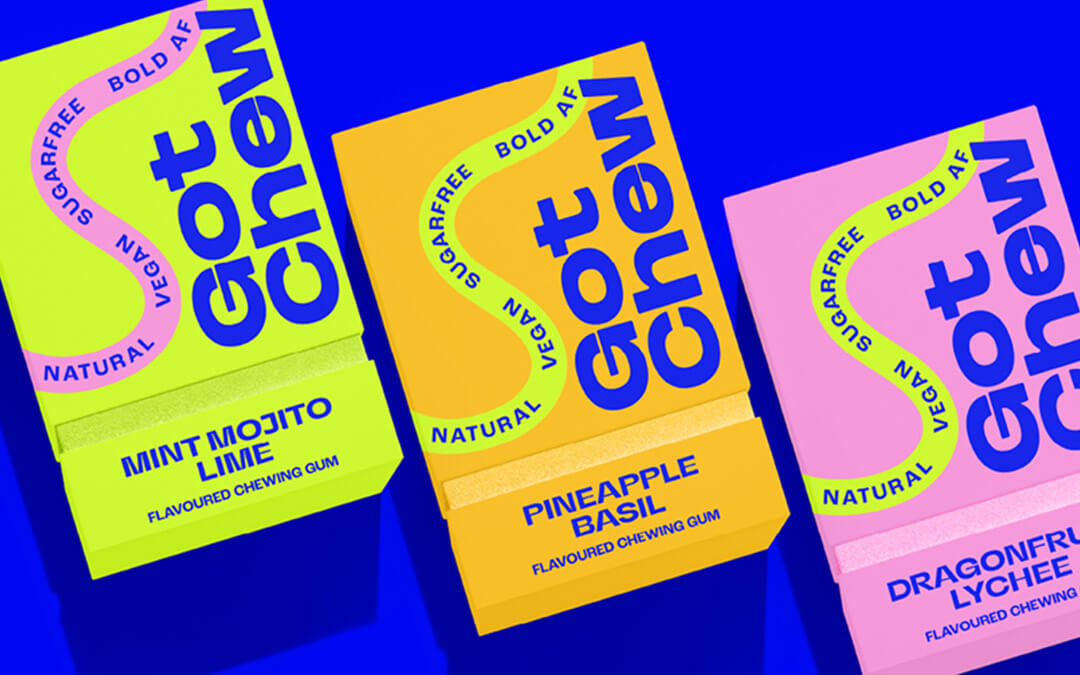
“Sad Beige” had its moment, but by 2026, brands are done whispering. Dopamine Branding is loud, bright, and unapologetically joyful. Think electric blues, sunset oranges, acid greens. Colours that do not just sit on the screen, but properly grab you.

In a world that can feel heavy, brands are stepping in as a source of energy and optimism. High contrast and high saturation are no longer just aesthetic choices. They are emotional ones. Used well, colour can lift a mood, spark curiosity, and make a brand feel more human.

A great example is GF Smith. On paper, quite literally, it is a paper brand. Traditionally not the most exciting category. But their recent rebrand flipped that expectation on its head. By leaning into bold colour, expressive layouts, and confident graphic design, GF Smith turned something functional into something vibrant and creative. It proves that optimism is not reserved for playful startups. Even the most practical industries can inject joy into their visual identity.

How to use it:

If your brand palette is feeling a bit polite, it might be time to turn the volume up. You do not need to rip up your logo, but your packaging, social content, and digital assets should feel more like a shot of espresso than a calming herbal tea.

CREDIT: Morgan Hastie

5. Kinetic Everything

(If It Doesn’t Move, It’s Dead)

Static brands are struggling to keep up. In a world built around scrolling, swiping, and instant feedback, motion has become part of how brands speak.

This is where motion branding comes in. It is not just about making videos. It is about building movement into the brand system itself. Logos that animate with purpose, icons that respond, typography that shifts as users move through a site. When done properly, motion adds clarity, character, and momentum.

A strong example is Lloyds Bank and their recent rebrand by Wolff Olins. Rather than simply refreshing the visuals, they brought the identity to life through kinetic animation. The iconic black horse now gallops, flows, and adapts across digital touchpoints. It respects the brand’s heritage while clearly pointing toward the future.

Then there is Klarna, who treat motion as a fundamental part of their brand language. Their animation guidelines go deep, defining how motion should behave, where it belongs, and where it does not. Animation becomes part of Klarna’s personality, adding confidence, humour, and clarity without ever feeling messy or overdone.

Here at Zap Creative, we have been applying the same thinking in our recent case studies. Kinetic elements help ideas pop, give work more character, and create a sense of flow across digital experiences. Motion is not there to show off. It is there to make brands feel alive.

How to use it:

Do not just ask for a PDF. Ask for a digital version that moves. Do not just post a still image. Post a loop. If your brand lives online, motion should be baked into the system, not added as an afterthought.

The Bottom Line

Trends come and go, but the need to stand out is forever.

At Zap, we don’t just slap a trend on a deck and call it a day. We look at your business, figure out what you’re trying to achieve, and then use these tools to help you get there faster. We’re office-based, we’re reactive, and we’re ready to graft.

Ready to 2026-proof
your brand?

Drop us a line. We’ll get the kettle on.