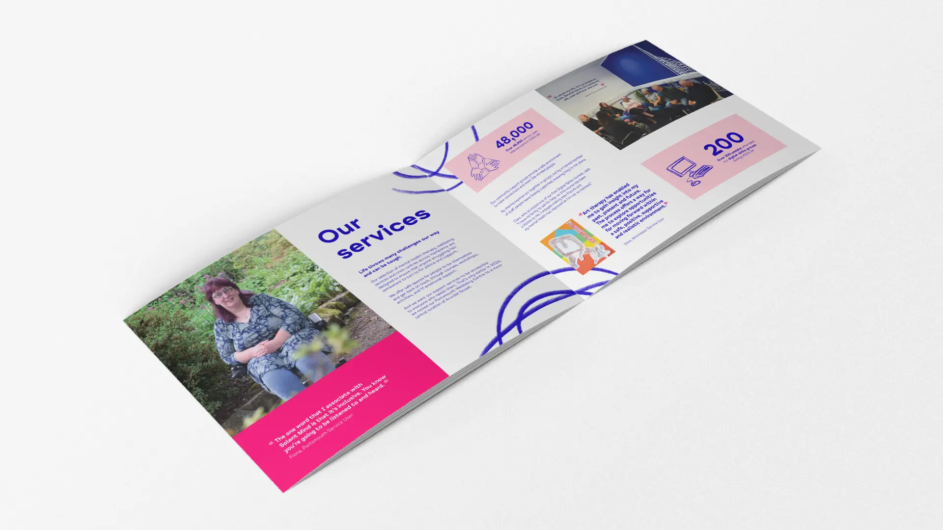
Infographics can transform even the most complex financial information into digestible visual formats. Use infographics in an annual report to highlight key metrics, programme outcomes, and year-on-year comparisons that demonstrate impact.
Pie charts, bar graphs, and timelines work effectively to convey statistical information at a glance. Ensure each graphic has a clear title, labels, and brief contextual explanation.
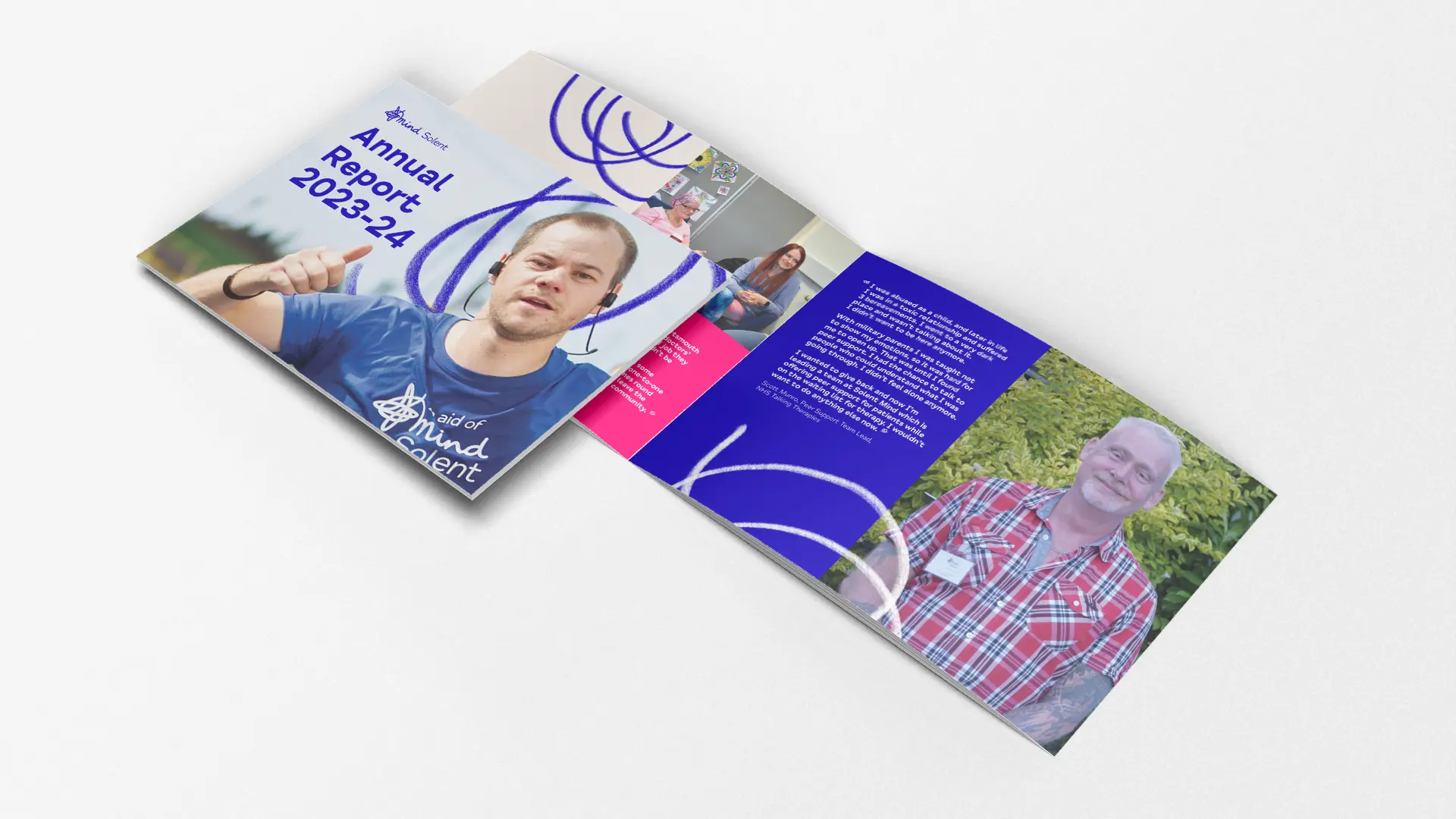
Photography humanises your work and creates emotional connections to the activities of your non-profit. Include high-quality images that show beneficiaries, volunteers, and staff engaged in meaningful activities related to your mission statement that was included earlier in the report.
Maintain visual consistency through a cohesive colour palette that aligns with your brand identity. Limit your selection to three to five complementary colours to create a professional, unified appearance.
Typography choices significantly impact readability. Font selection should balance your identity with legibility, typically pairing a distinctive heading font with a highly readable body text. Professional reports often employ limited font families, between two and three at a maximum) with variations in weight and size to create hierarchy.


