Striking a balance communicating with diverse audiences

By Ollie Noble

It’s great that we have an opportunity to support a worthy cause that will help our local community, especially when it crosses over into an area of design which I’m passionate about. ‘Could you help us brand up a skatepark?’

Uh…. yes please!

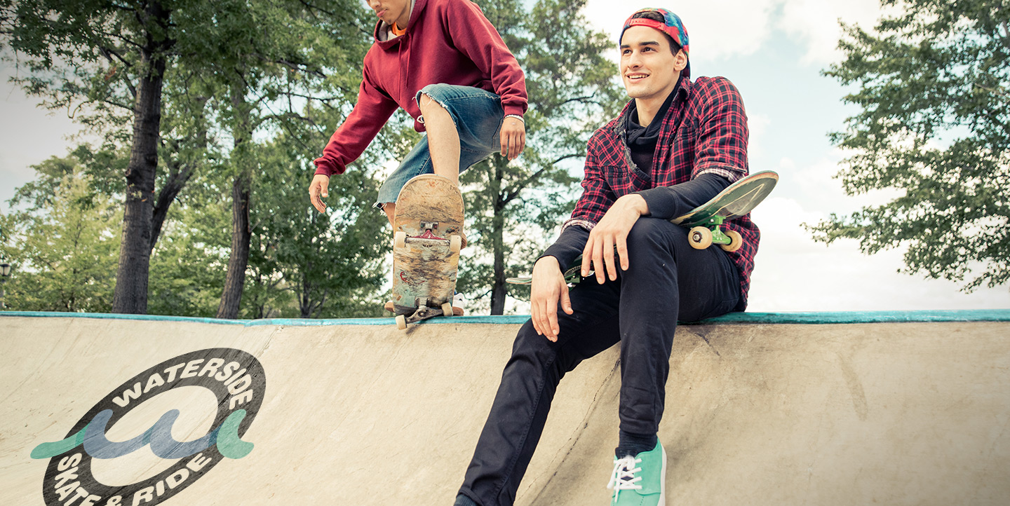
Growing up firmly attached to skate culture, fashion, video parts, deck designs, inventive tricks and everything else; this was a bit of a dream come true. I’ve always felt a connection to brands that don’t take themselves too seriously, and allow pure creative freedom. Skate brands featuring awesome scratchy gothic illustrations like those found on ‘enjoi’ and ‘welcome’ were (and still are) personal favourites.

When putting together branding for a client it is important to first assess who the client is and who the key stakeholders are, in the case of ‘Waterside skatepark’ in Hythe, this was a tricky situation as it had two key and very different audiences; the youth that would use the skatepark, and the investors that were needed to help fund the building of the skatepark. This caused a bit of a dilemma as we needed to create something that was interesting and cool enough for the younger audience, but also something reserved enough that investors could feel confident to invest in.

This was a difficult task as a lot of people in the skate scene are sick and tired of their culture being commercialised – for example when ‘Nike’ first started to cash in with their skate shoes ‘Nike SB’ the product was generally boycotted for some time, until Nike had proved that they were passionate enough about the sport (by putting a lot of money into the right places) that some skaters started to come round to the idea. Adidas had a head start in this regard as one of their classic shoes the ‘Stan Smiths’ were a favourite among early day skaters as it was one of the only shoes around at the time which suited the sport – this was because Stan Smith the tennis player was a keen skater, and often used his custom tennis shoe for the court and for skating through New York after practice so he designed the shoe to suit that need.
We started out the process of branding with our usual initial stage of the creative process – by scanning resources and existing examples, we were able to build a picture and gain an insight into what was currently resonating with the youth side of our target audience – some prior knowledge of skate brand/culture was helpful here.

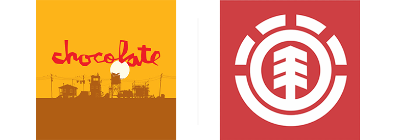
In the initial stages we concepted some logos that were in the same ball park as some of the more reserved existing skate brand logos like ‘chocolate’ and ‘element’ skateboards, conscious that we didn’t want to scare off investors with logos in line with other popular brands such as ‘zero’ or ‘heroin’ skateboards.

Starting with the ‘chocolate’ inspired logo I was aiming to attain the rough but considered typography style they’ve implemented so well, this took time and was a tricky balance, but once achieved, the logo lent itself well to application across purposes such as social media, which is super important considering the project needs to gain attention from the public, and with public interest comes investor interest.

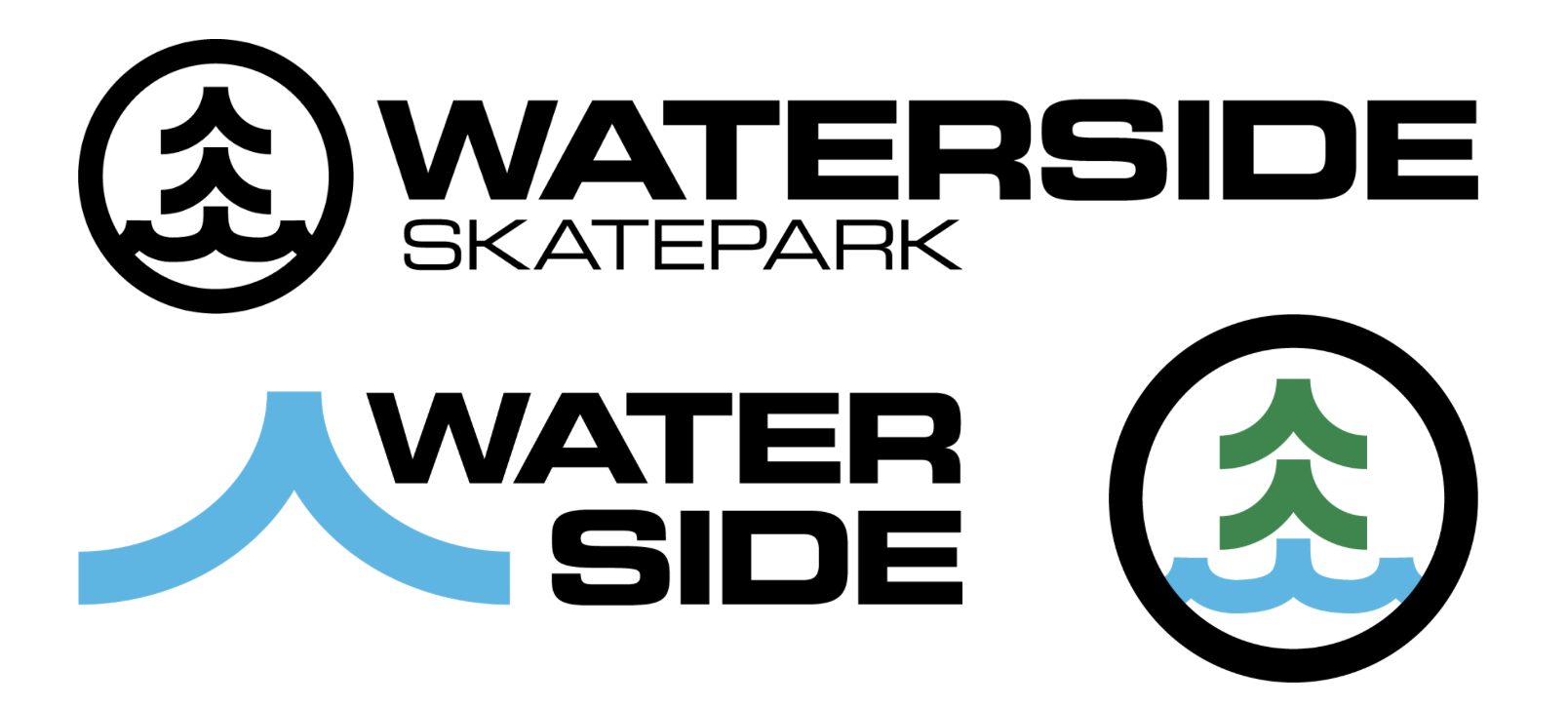
This route had skater written all over it, however we felt it’s unusual typographic form might be off putting for our investor audience. We also needed more ownablilty and wanted to try and tie the symbol in to the geographical location – the forest and the waterfront.

The second concept was inspired by the Element branding as this is about the most reserved logo for a company within the skate industry, so we felt it would be a safer bet for the investor side of the target audience, using familiar typefaces and a symbol alongside to boost recognition. Using Hythe as inspiration we attempted to create an icon that could interchange between the representation of trees and ocean. Below is the result of this idea…

waterside old

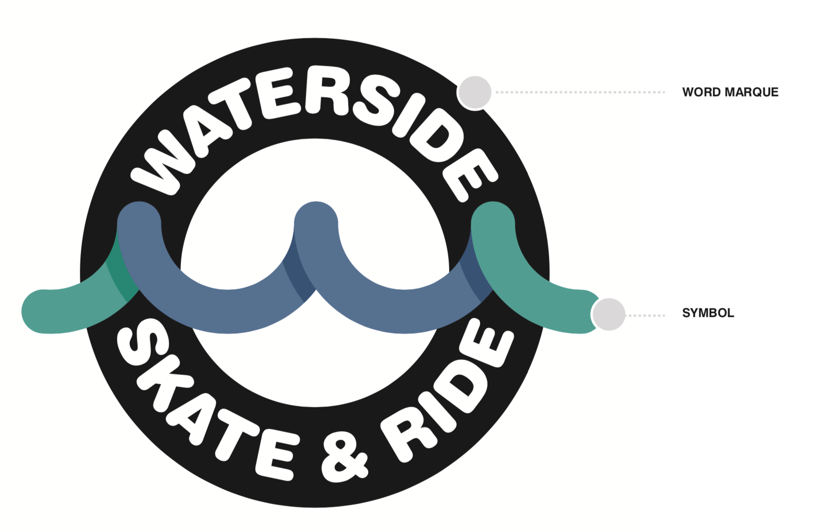
We felt these were both strong visually, but were concerned they they had possibly gone too far the other way, and could be working harder to link in with our youthful skater audience. So, back to the drawing board to see if we can dig a little deeper. Taking the geometric wave symbol out of the previous concepts, we noticed it shared a very familiar form to a recognisable symbol for skaters – the half pipe ramp. Taking the circular shapes and repeating it we’d managed to create a way to visualise both the waterside location via the wave, and the skate ramp.

We’d managed to nail the symbol, and once that was in place it made the word marque and final form a lot more obvious. Selecting a rounded typeface that resonated with the curves in the symbol, and running it around a black circle it perfectly mimicked the wheel of a skateboard or BMX.

waterside

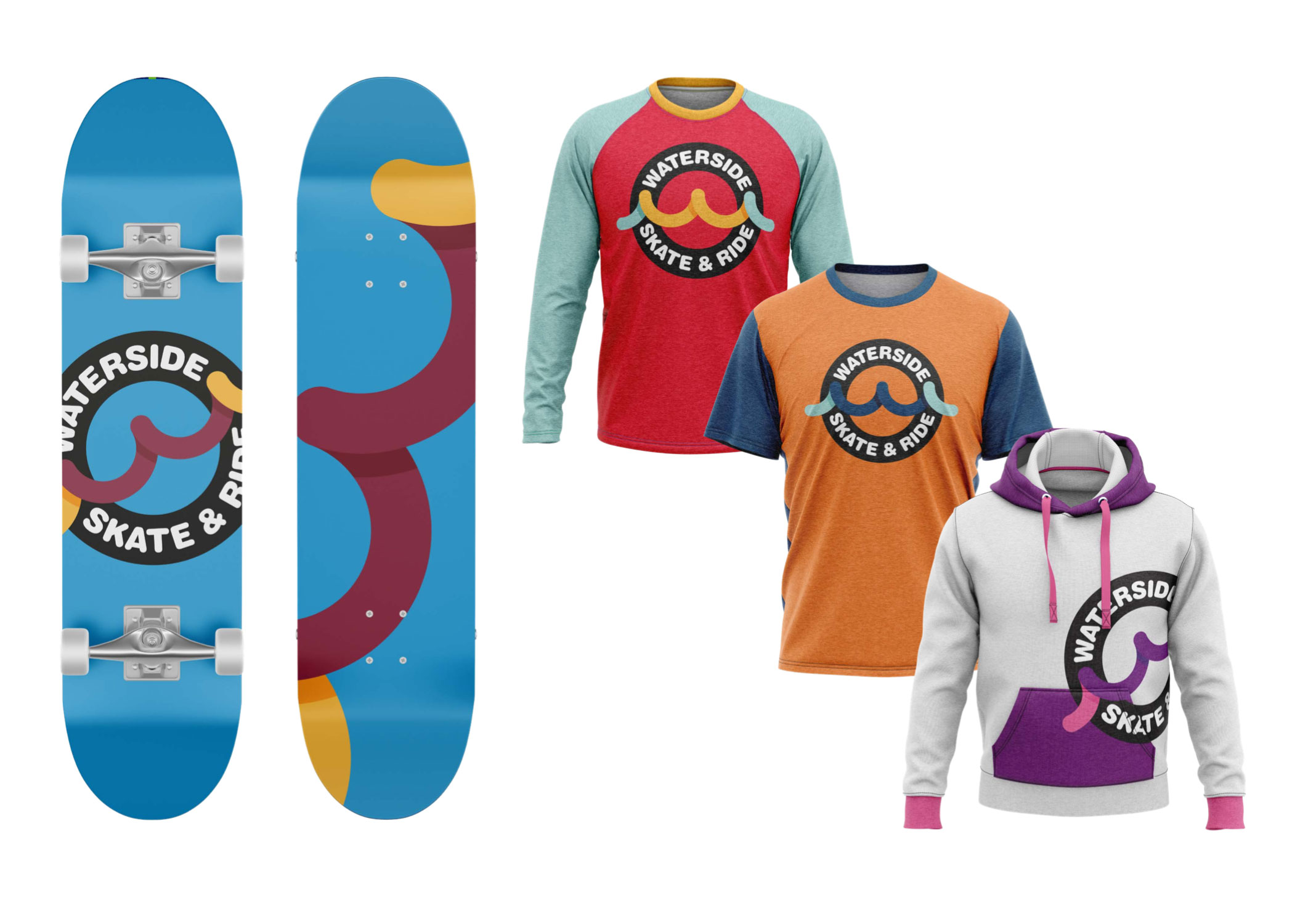
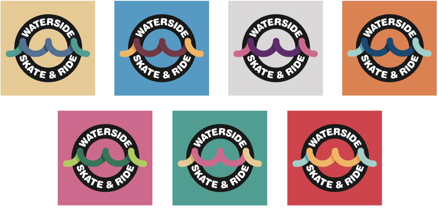
This logo was taken on by the client, which we’re really pleased with. We produced a range of colour ways to give maximum flexibility and vibrancy to the new brand’s visual language. This range also helps with our dual audience challenge, as we can select bold impactful combinations for the skater communications, and more subtle muted combinations for the investor communications.

skate
waterside colours

 In summary, it was not easy to produce a brand that communicates with two very different target audiences. But with some good research and experimentation, digging deeper at every opportunity and not settling for ‘good enough’, constantly asking questions of ourselves and coming back to review our clients objectives, we think it’s entirely possible.

skate park

More news

archetypes
responsive logos