


Bringing support to GLP1 users

Gulp was born from a very specific requirement – to provide a carefully crafted balance of micronutrients, prebiotics, and probiotics to support gut health, digestion, and overall wellness to GLP1 (Ozempic) users. Our task was to create a brand and packaging to land in the emerging GLP1 marketplace.

The Challenge

GLP1 is a very new treatment with a lot of stigma around it. We needed to create a brand amplified Gulps’s ambitions of creating a supportive community that partners with users on their wellness journey.

The brand needed to feel warm, accessible and community-led, while still reflecting the clinically balanced nutrition behind the product. Less scary science lesson. More supportive expert in your corner.

The Solution

We identified the key tension between feeling accessible and friendly, while also being scientifically grounded and professionally reassuring.

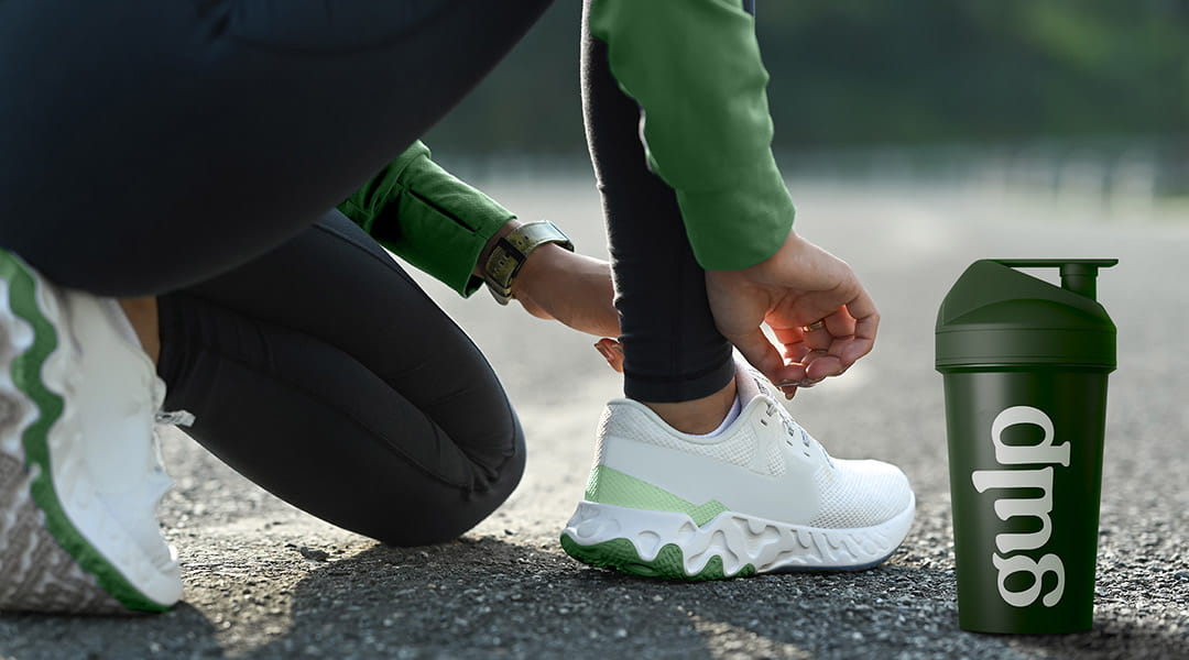
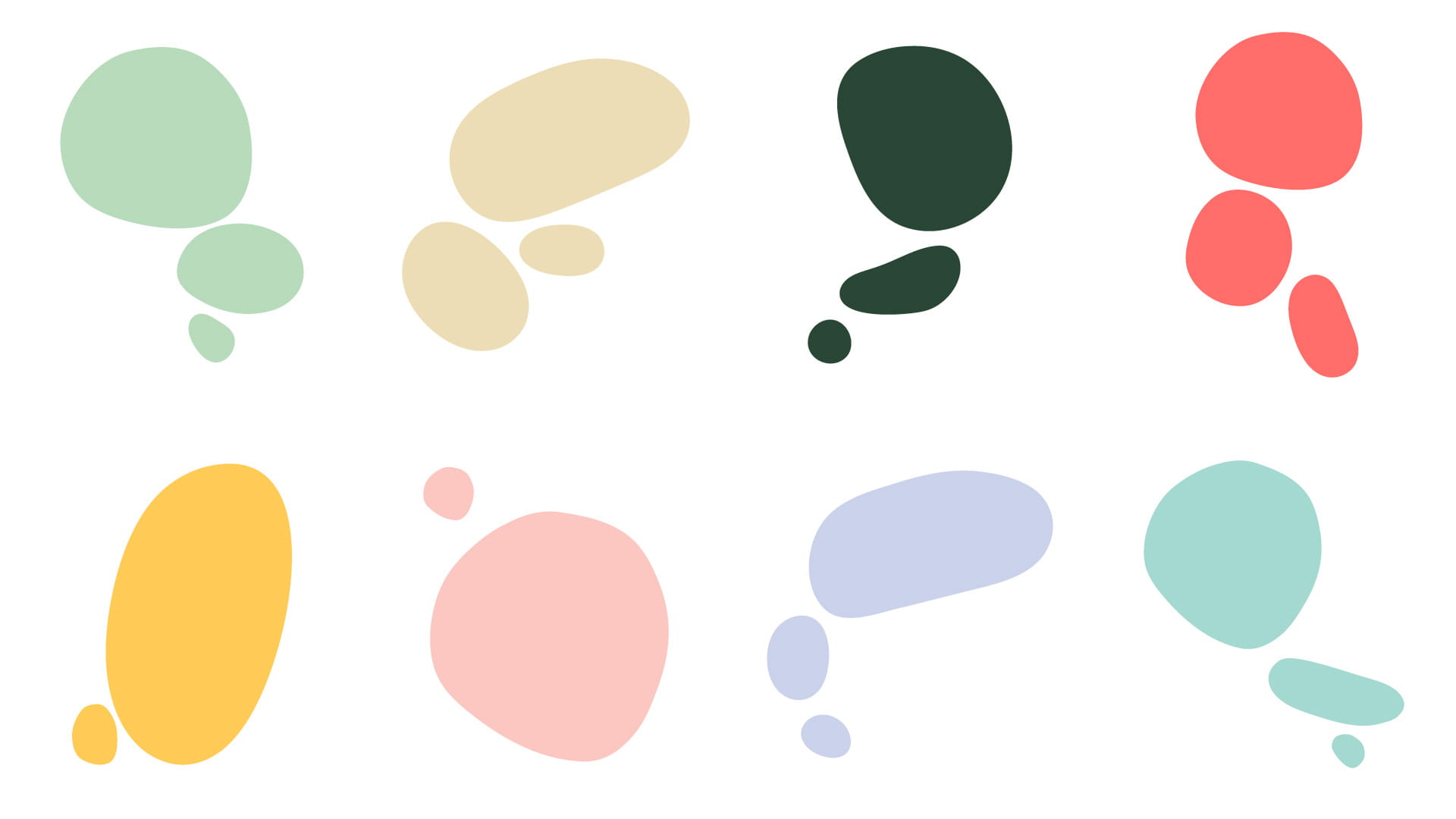
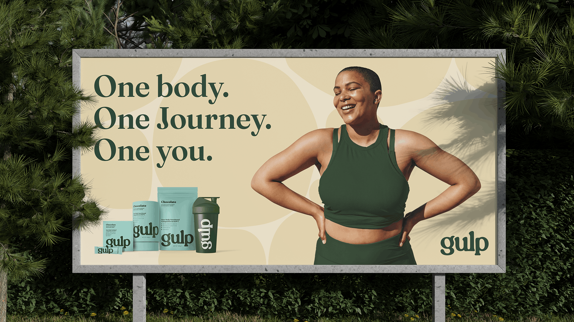
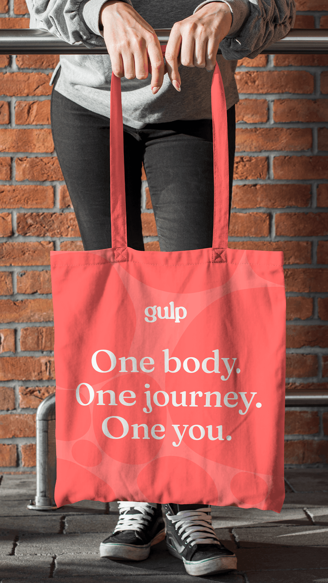
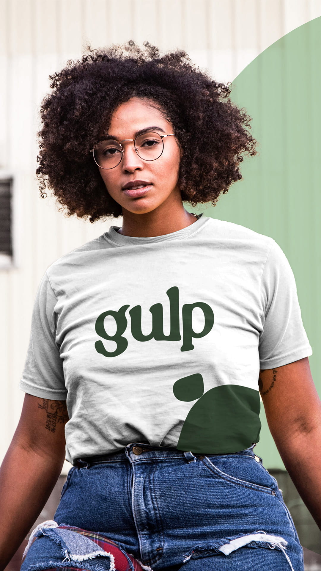
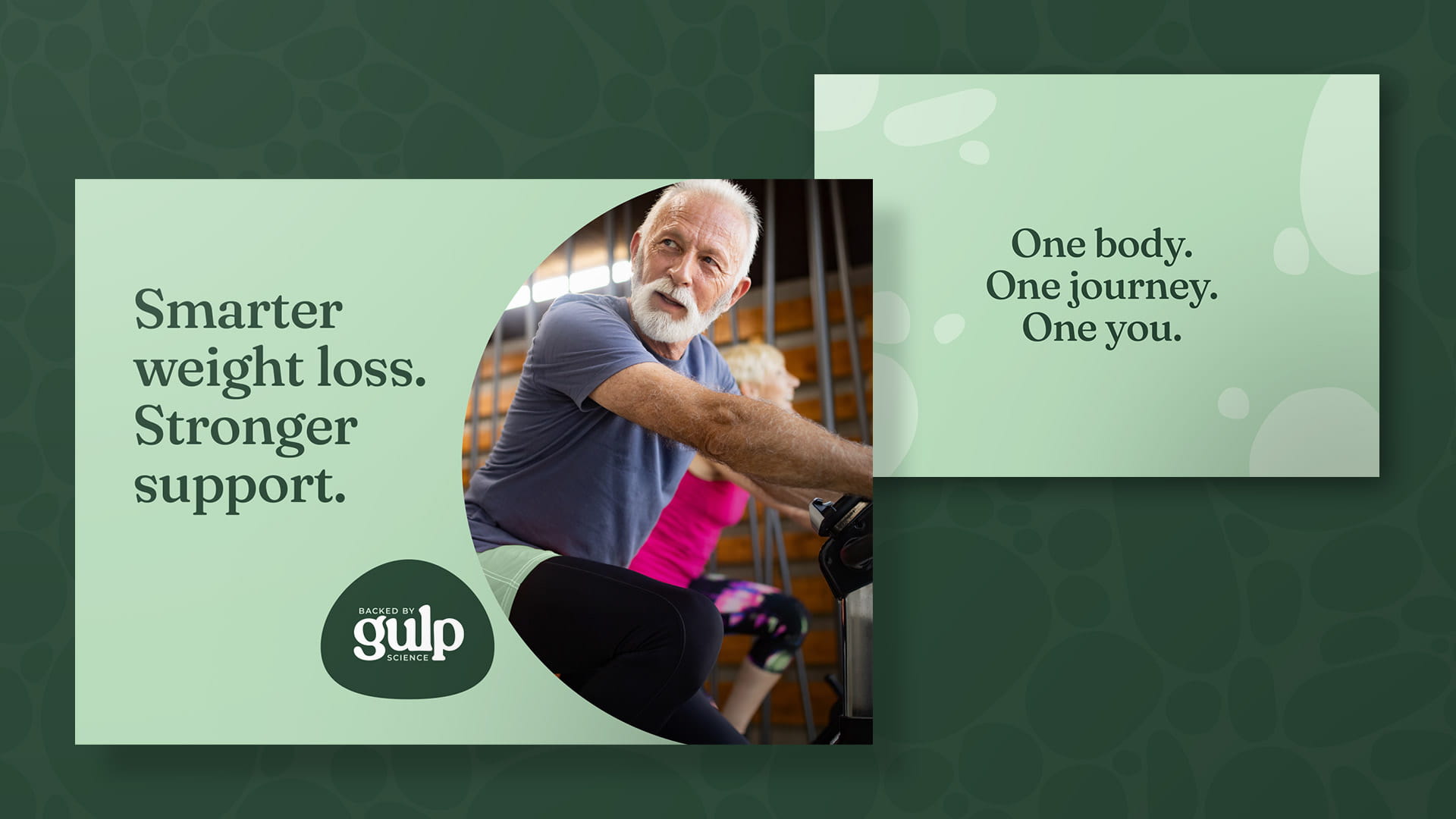
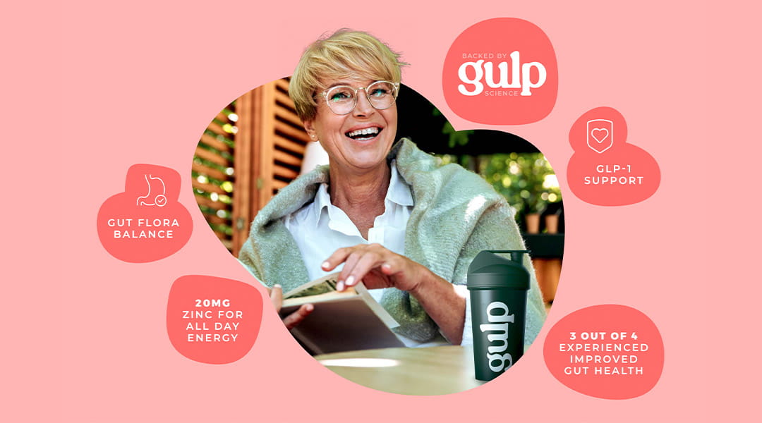
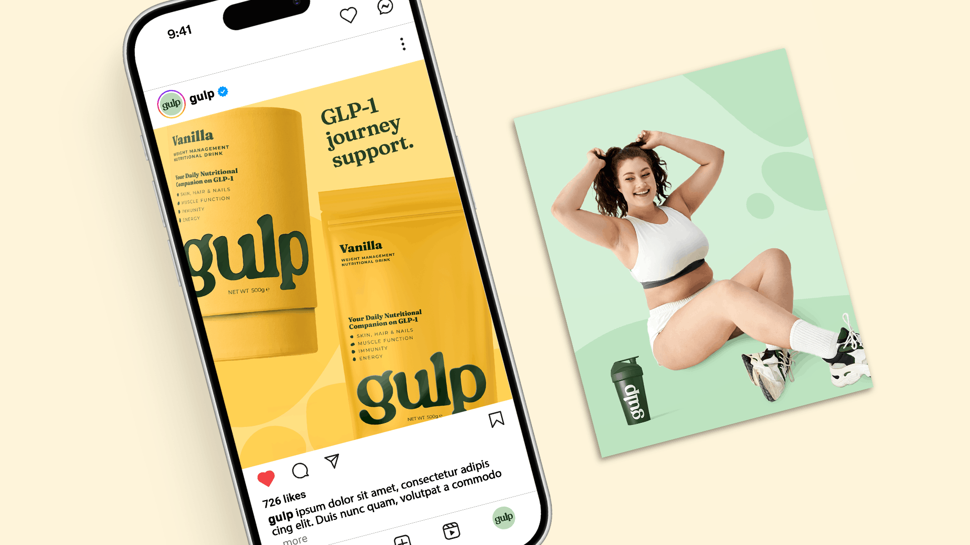
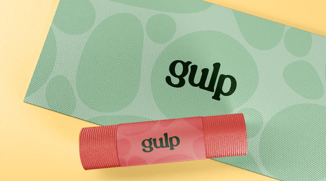
We created a warm, organic brandmark with a sense of flow between its letters, alongside a wider visual language built around irregular circles we called the Adipose. Inspired by fat cells breaking down, these shapes could merge, flow and adapt to reflect variety, inclusion and community. The imagery follows suit with real relatable people embarking on their journey, not Instagram models.

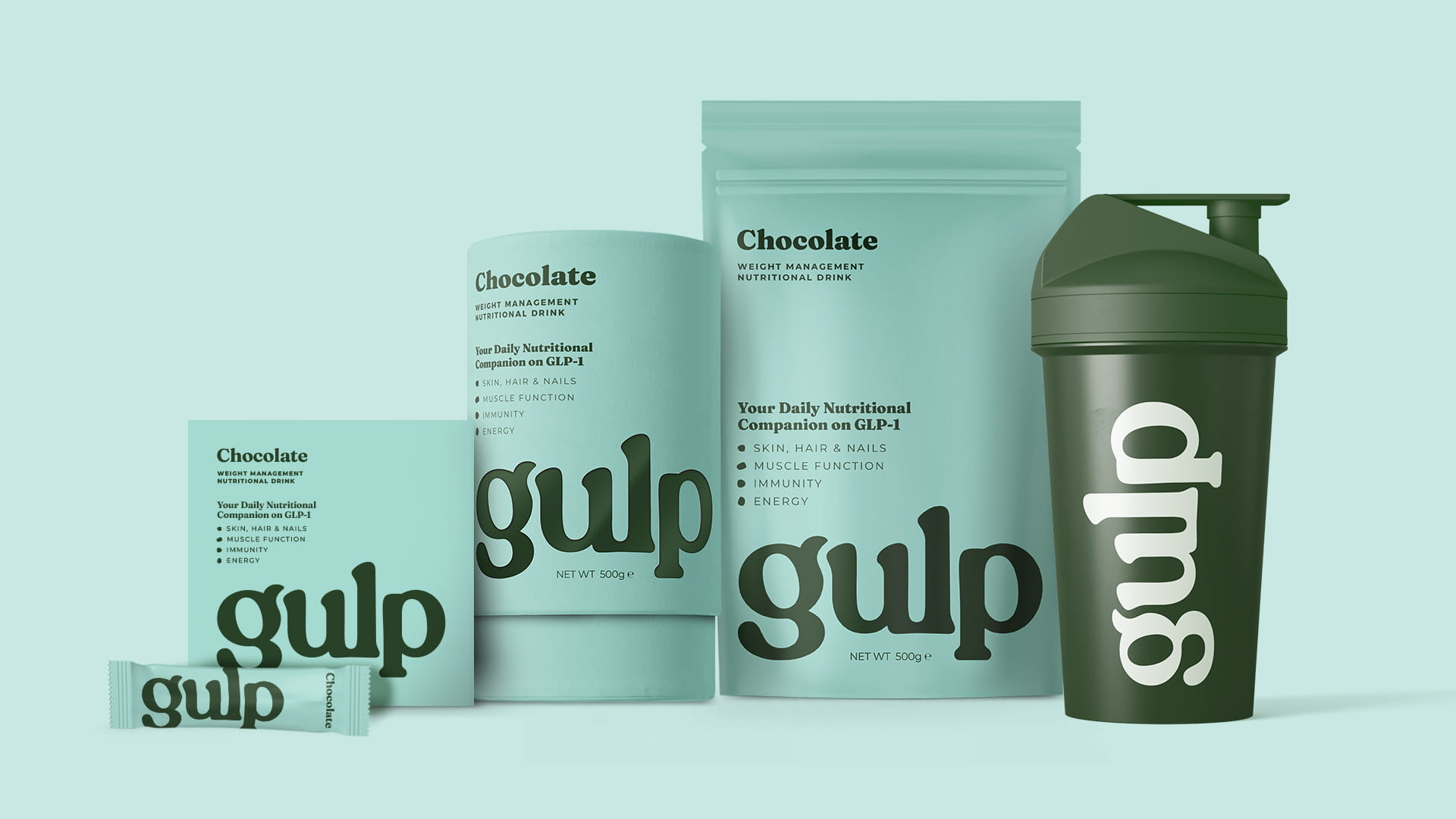
We then developed packaging with clear shelf appeal and a scalable system, with a minimal sleek aesthetic that people would be happy to see on their kitchen counter.

The Solution

We identified the key tension between feeling accessible and friendly, while also being scientifically grounded and professionally reassuring.

We created a warm, organic brandmark with a sense of flow between its letters, alongside a wider visual language built around irregular circles we called the Adipose. Inspired by fat cells breaking down, these shapes could merge, flow and adapt to reflect variety, inclusion and community. The imagery follows suit with real relatable people embarking on their journey, not Instagram models.

We then developed packaging with clear shelf appeal and a scalable system, with a minimal sleek aesthetic that people would be happy to see on their kitchen counter.

Services Provided

Identity Design
Brand Strategy
Copywriting
Animation
Packaging

The Result

The result was a brand with genuine warmth and scientific credibility in equal measure,
a scalable identity system with clear shelf presence, built to grow alongside the product range from day one.

The Result

The result was a brand with genuine warmth and scientific credibility in equal measure, a scalable identity system with clear shelf presence, built to grow alongside the product range from day one.

Lörem ipsum nirade jyde ekomani sanynas. Diaturade or. Biona eren: trena nir. Matbil krolåpohet öment.

John Doe – Lorem Ipsum, Lorem Ipsum

John Doe
Lorem Ipsum, Lorem Ipsum