Nutritious drinks bursting with character

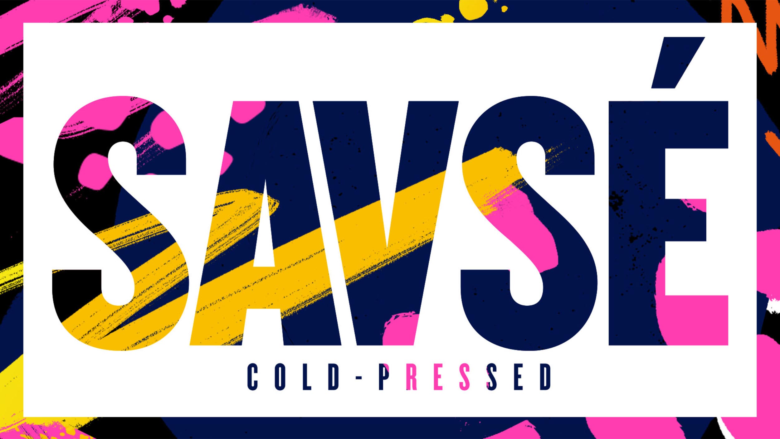
The Savse cold-pressed unpasteurised smoothie had a fantastic product but the brand was in need of a rebirth, to re-engage a new segment of the market. The name is a Georgian word meaning ‘crammed full of goodness’. This characterised the product well as the cold-pressed production process means it is literally alive with nutrients, as opposed to pasteurised products which kills a lot of the nutrients.

savse

The Challenge

We were briefed with creating a new brand identity and packaging design that conveyed the feeling that the product was alive inside and full of nutrition, due to the cold-pressed production process. We needed to come up with a way of communicating this whilst also differentiating from the competition, who were largely focussed on the ingredients and flavour.

The Solution

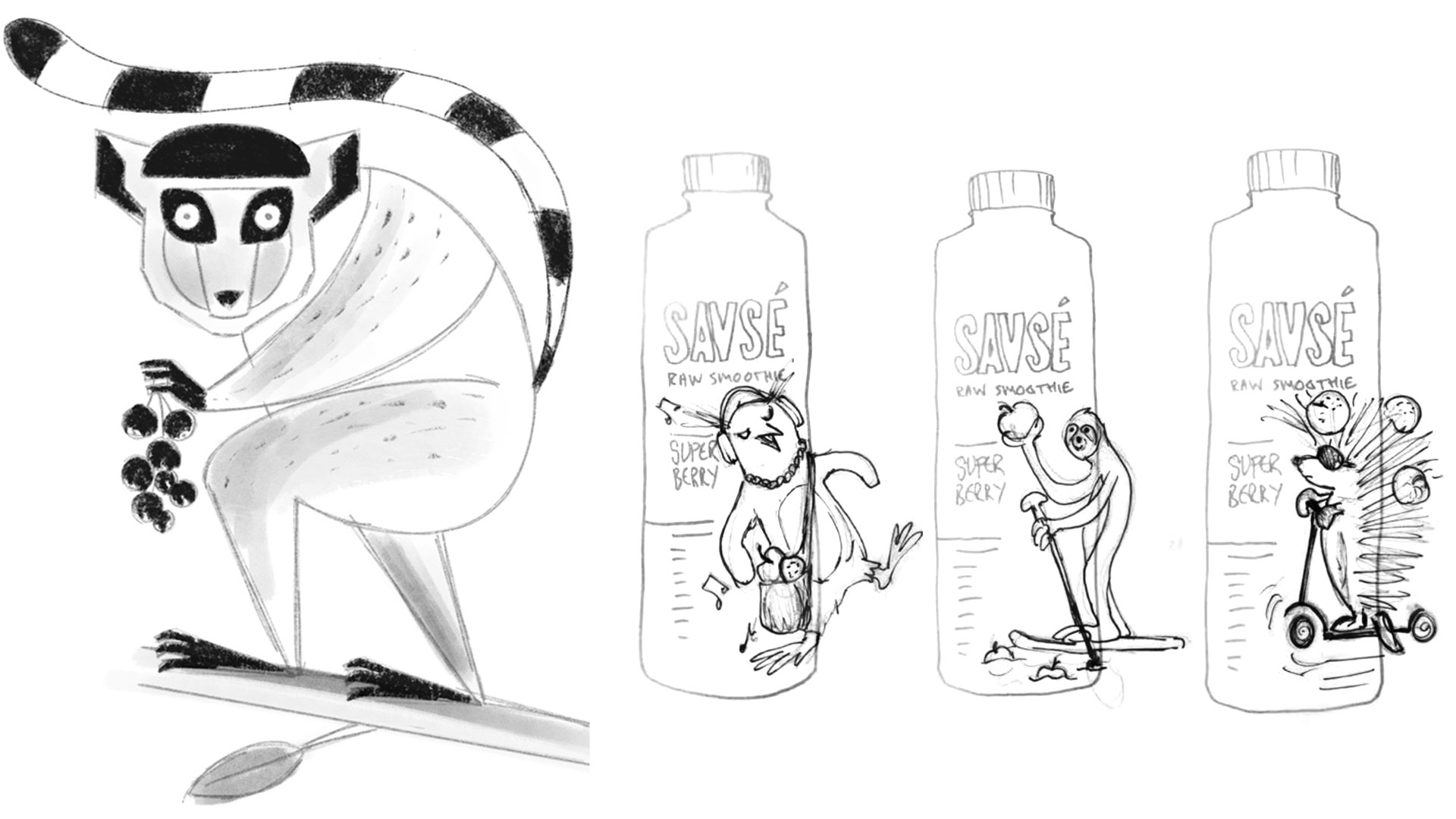
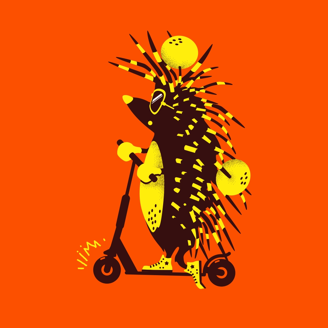
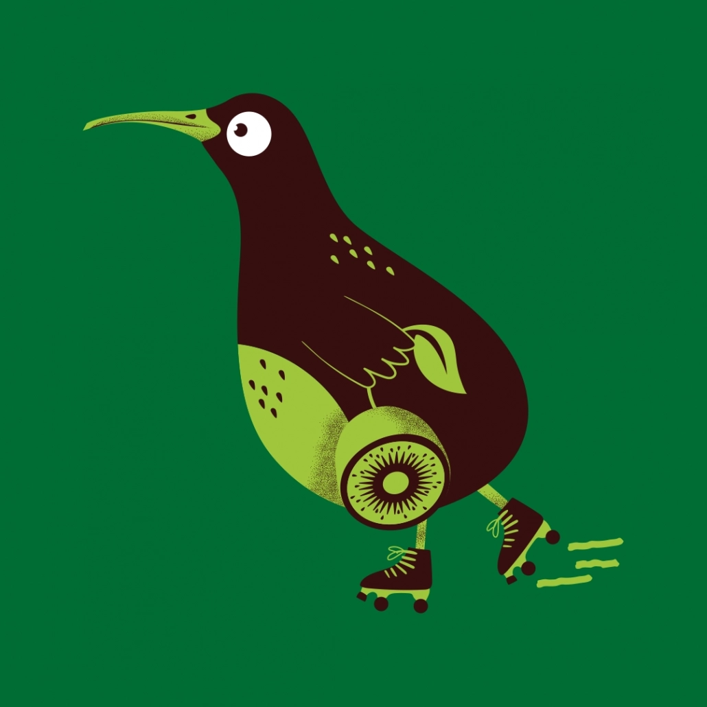
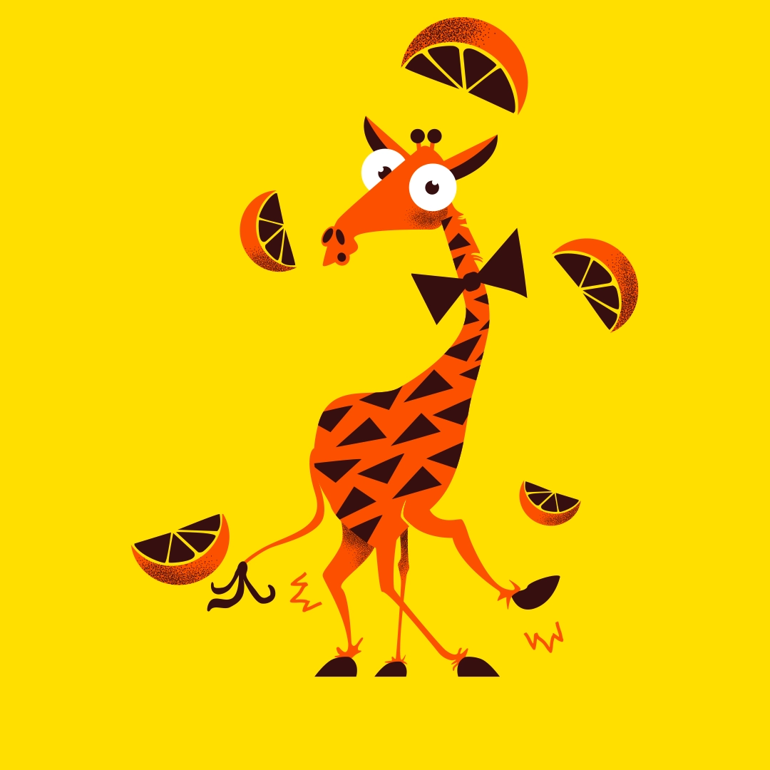
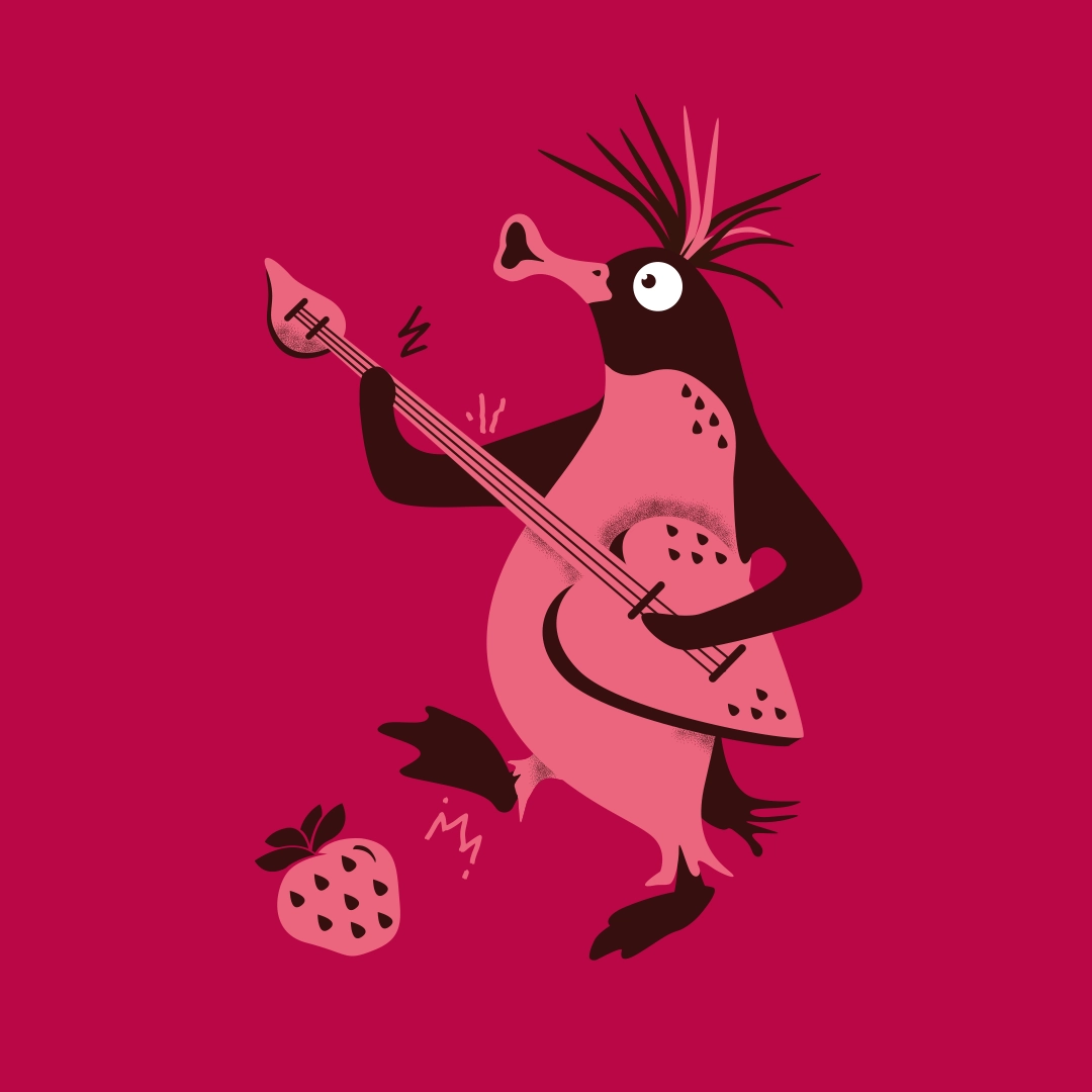
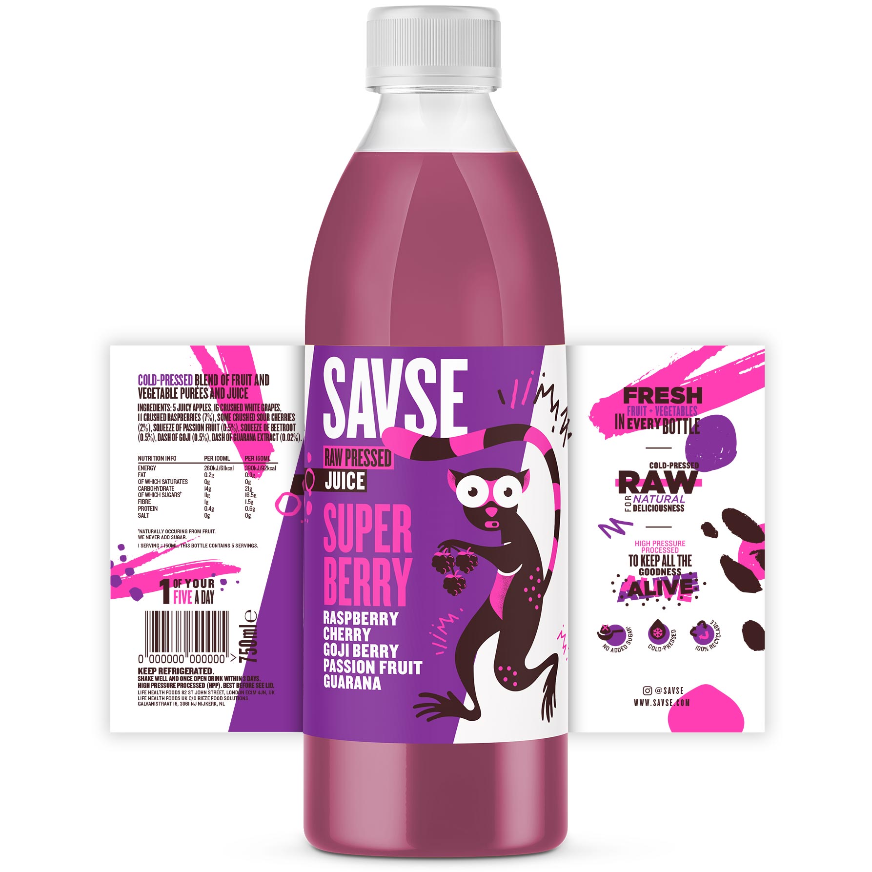
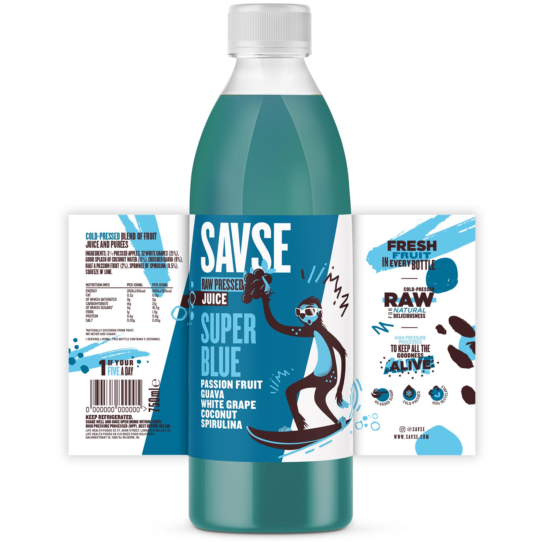
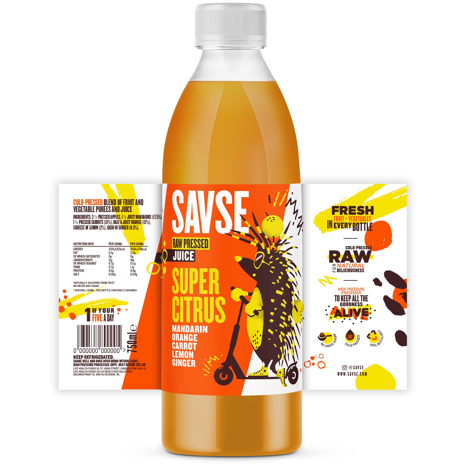
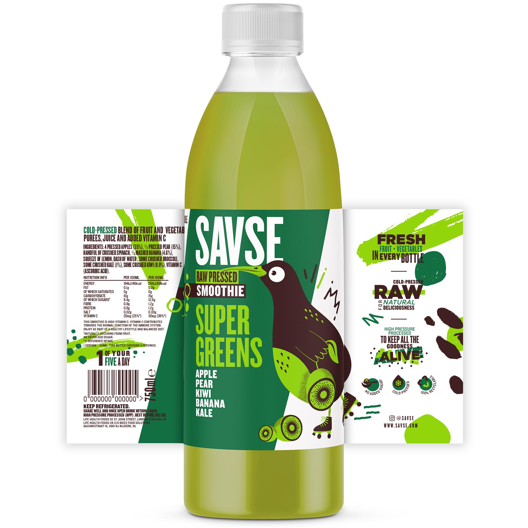
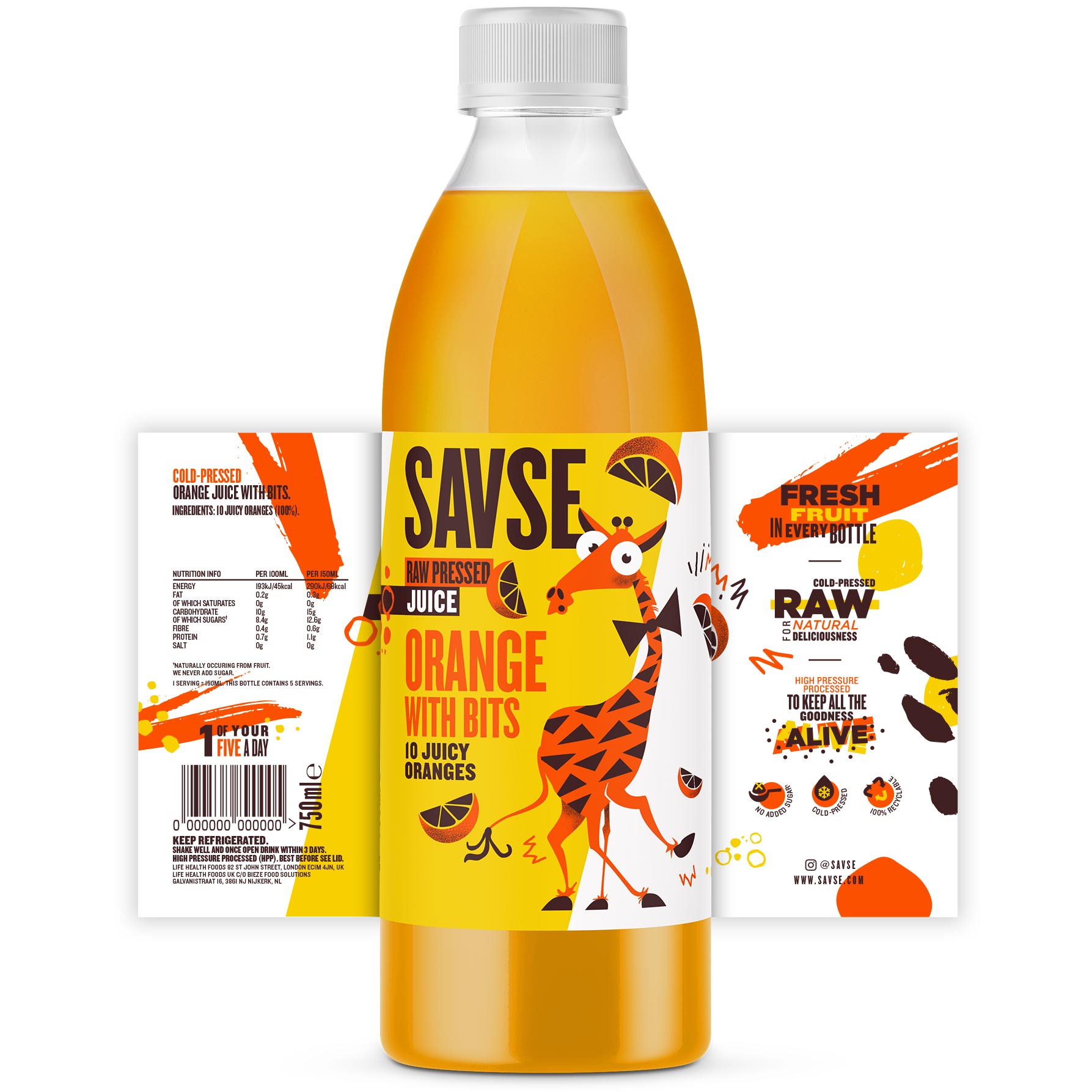
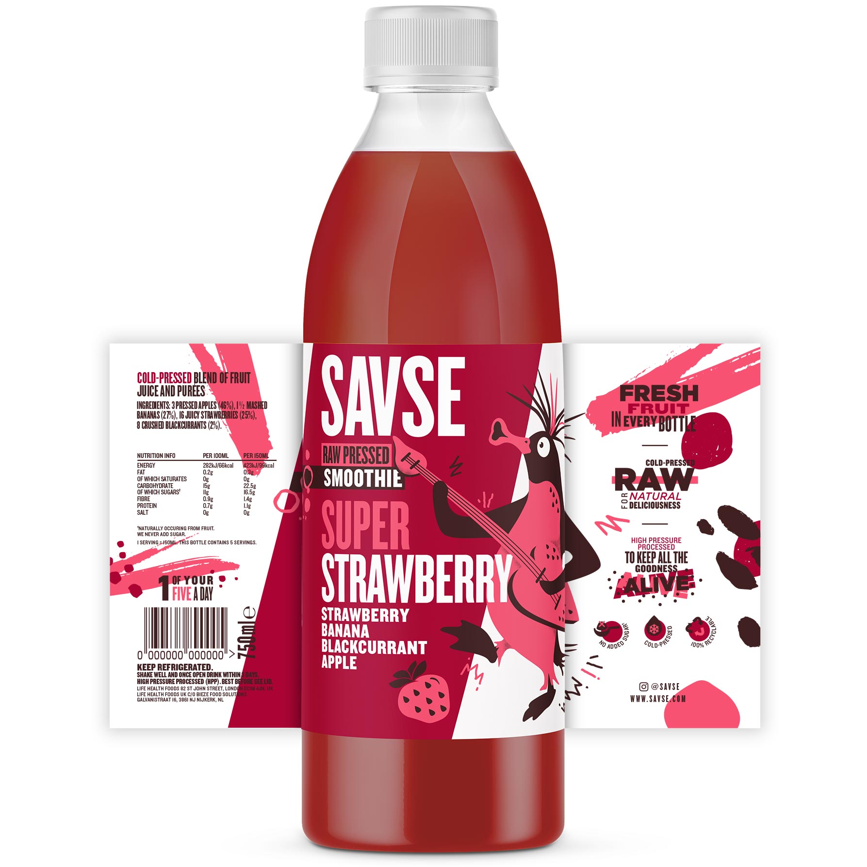
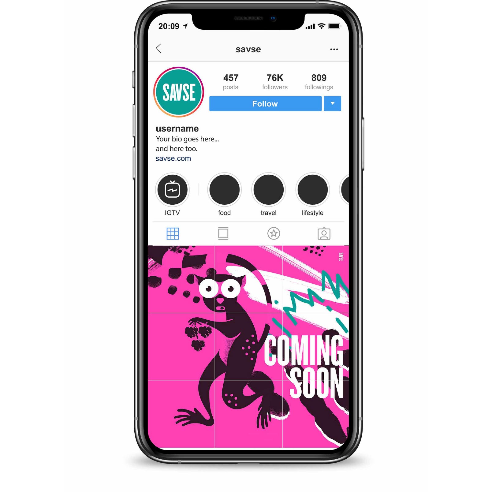
We chose to use unique playful animal illustrations to symbolise the character of the brand, the freshness of the product and the energy that it gives the consumer. A series of animal characters were developed and refined, alongside a brand world which was exploding with colour and vibrant graphical landscapes.

Services Provided

  • Brand Development
  • Character Illustration
  • 3D Rendering & Visualisations
  • Presentation Design

Character Illustration

savse sketches
savse

Product Packaging

berry
blue
citrus
greens
orange
strawberry

social

The Result

The vibrant colourful brand is still at the concept phase and we’re looking forward to seeing it make a splash on supermarket shelves.  

The Result

The vibrant colourful brand is still at the concept phase and we’re looking forward to seeing it make a splash on supermarket shelves.