

What we’ve learned from client projects that challenged us

Author: Luke Mostran

The easy projects are lovely. Everything lines up, the first idea works and nobody has to stare at a layout for three hours wondering why it still feels slightly… off.

But the projects that really teach us something? They tend to be the awkward ones.

The ones with fifteen different things to communicate. The ones that need to appeal to completely different audiences. The ones where the brand needs to make an impact without becoming the main attraction. Or where the creative idea is great in theory, but needs a bit of wrestling before it behaves in the real world.

We’ve worked on brands and campaigns for festivals, museums, music venues, challenger products and visitor attractions. Every project came with its own creative puzzle, and every one pushed us to think differently.

Here are five client projects that challenged us, how we tackled them and what we took into the next job.

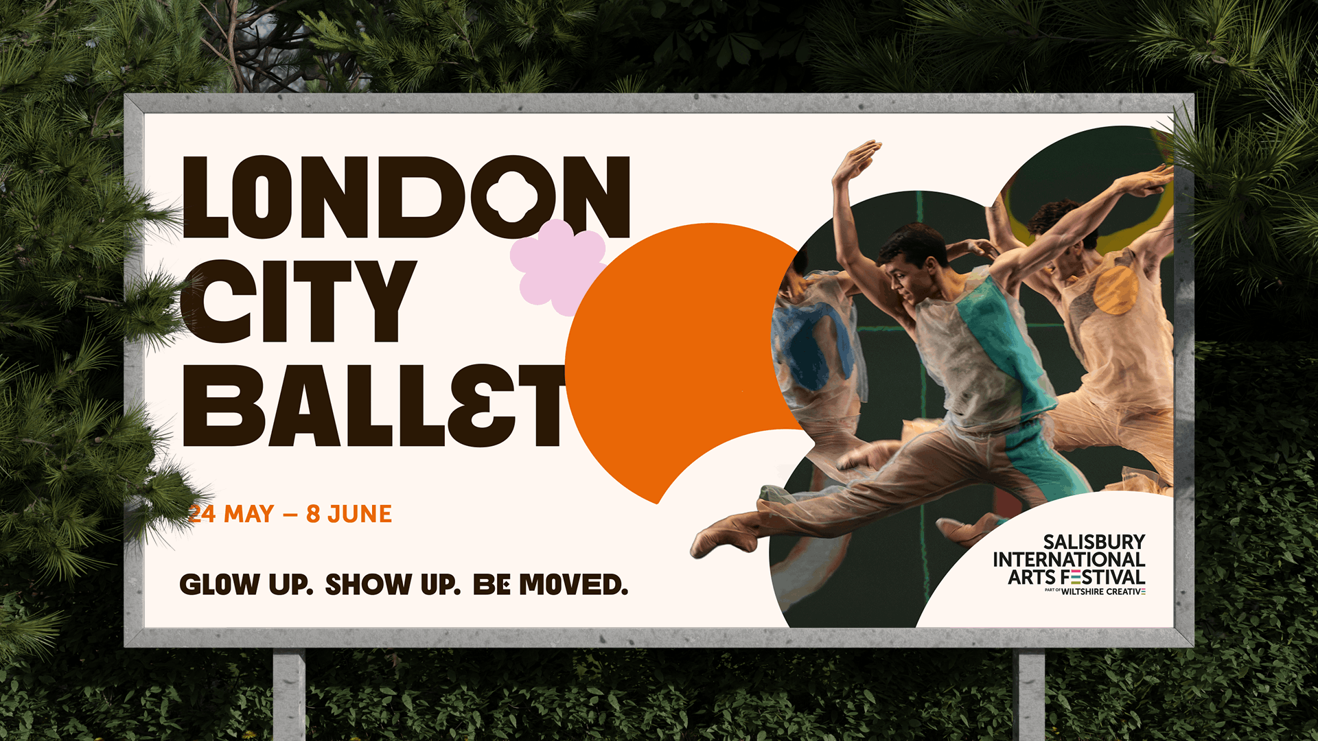
1. Salisbury International Arts Festival

Let the place do the talking

The challenge

Salisbury International Arts Festival needed an identity that captured the joy, energy and variety of the event while still feeling unmistakably connected to Salisbury. It would have been easy to create something bright, expressive and suitably “arty”, but if it could have belonged to any festival in any city, we wouldn’t have done the job properly.

The challenge was finding a visual language that felt fresh without feeling parachuted in: something the festival could own, but local audiences could immediately recognise.

How we overcame it

We stopped looking for a generic symbol of creativity and started looking more closely at Salisbury itself. The city’s architecture gave us the answer, with shapes inspired by its landmarks and ornate windows becoming a flexible graphical system that could frame the festival’s performances, people and experiences.

We carried that thinking into the typography, using interchangeable letterforms to reflect the variety of the programme, while a rich colour palette inspired by Wiltshire and the arts brought the energy. Instead of simply putting Salisbury landmarks on posters, we turned the visual character of the place into a design tool.

What we learned

Local relevance does not have to mean using the most obvious landmark and calling it a day. The strongest place-based identities often come from noticing smaller, more distinctive details: a window shape, a pattern, a material or a piece of visual history.

Abstracted in the right way, those details can become a flexible brand system rather than a decorative gimmick. The lesson: don’t just show the place. Build with it.

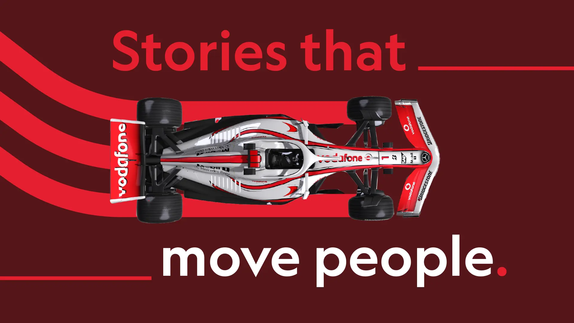
2. National Motor Museum

Make the brand move, then know when to park it

The challenge

The National Motor Museum has a world-class collection spanning different eras, stories and ideas about motoring, so choosing one vehicle to represent it would always exclude hundreds of others.

The museum’s identity also needed to be distinctive without constantly fighting the exhibits for attention, because sometimes the brand is the hero and sometimes a priceless car is the hero. We needed to communicate motion, progress and the journey of motoring without relying on one particular vehicle or creating an identity that dominated everything around it.

How we overcame it

Rather than illustrating the objects in the collection, we focused on what connects them: movement. Inspired by vintage motoring posters, we created a suite of roads and speed lines that could swoop, dip and corner around photography, text and layouts, capturing both the physical movement of vehicles and the wider journey of motoring through history.

The system gave the identity energy when it needed to attract attention, while remaining simple enough to sit quietly behind the exhibits when they needed centre stage.

What we learned

A successful brand does not need to shout across every application. Sometimes the cleverest identity is one with gears: expressive on campaign material, informative on signage and restrained beside the thing people have actually come to see.

Designing that flexibility from the beginning is far more effective than creating one loud idea and trying to turn the volume down later. The lesson: a brand should know when to lead and when to let the experience take over.

national motor museum promo image

3. Pleese Freezecakes

Chaos needs rules

The challenge

Pleese already had personality, but Freezecakes needed to reach a broader consumer audience and compete with some very established freezer-aisle names. Blending in was not an option, so the identity needed to feel bold, playful and disruptive across multiple flavours and formats, using an expansive colour palette and an energetic, hand-drawn aesthetic.

The potential problem was that giving every colour permission to sit beside every other colour could quickly take things from “deliciously disruptive” to “someone has dropped the stationery cupboard”.

How we overcame it

We embraced the mess, but controlled it. A broad palette gave individual products and flavours their own energy, while clear restrictions around colour combinations and contrast kept the range coherent and legible.

The colours could clash, but they had to clash well. Hand-drawn illustration, iconography and typography gave the brand its rebellious character, while the underlying design rules made sure it remained recognisable across packaging, social content and campaign assets. What looked spontaneous on the surface was held together by a carefully considered system underneath.

What we learned

Maximalism is not the absence of rules; in fact, it often needs more rules than minimalism. When there are lots of colours, illustrations, messages and graphic elements competing for attention, designers need to be ruthless about hierarchy, contrast and consistency.

The audience should feel the energy, not see the spreadsheet behind it. The lesson: creative freedom works best when it has something solid to push against.

Pleesecakes

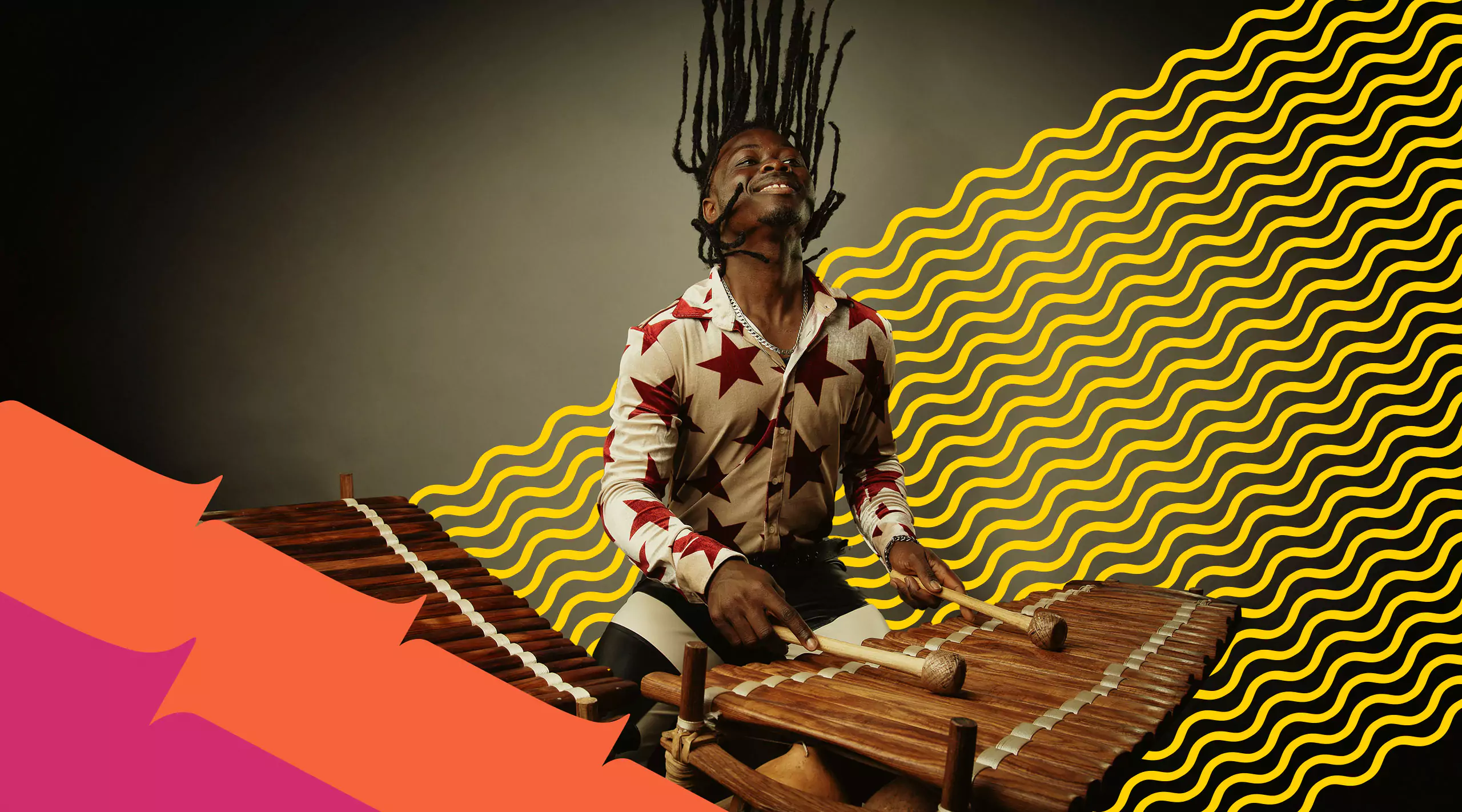
4. Turner Sims

Design for everyone without designing for no one

The challenge

Turner Sims wanted to introduce younger and more diverse audiences to its programme while remaining welcoming to the loyal audiences who already knew and loved the venue. Its existing identity felt corporate and emotionally disconnected from the live music experience, but the challenge was broader than simply making the venue appear younger.

We needed to create something inclusive, expressive and joyful without chasing youth culture or alienating existing audiences, because trying to appeal to everyone can easily produce something so carefully neutral that nobody feels anything.

How we overcame it

We focused on the emotion shared by every part of the audience: the joy of music. That simple idea became the heart of the brand and gave us a stronger creative foundation than an age group or demographic profile ever could. A responsive logotype used a vibrato line to represent changing musical pitches, while repeating patterns drew inspiration from the shapes and decorative details of instruments.

These elements gave us a visual language that could flex across classical music, jazz, global sounds and contemporary performances, with a vibrant palette adding energy while keeping the overall system recognisable.

What we learned

When a brand needs to connect with very different audiences, the answer is not always to find a visual compromise between them.

It is often more powerful to identify the emotional truth that unites them. For Turner Sims, that was not a particular genre, age or musical taste; it was what live music makes people feel. The lesson: design around a shared emotion, not an imaginary average person.

turner sims

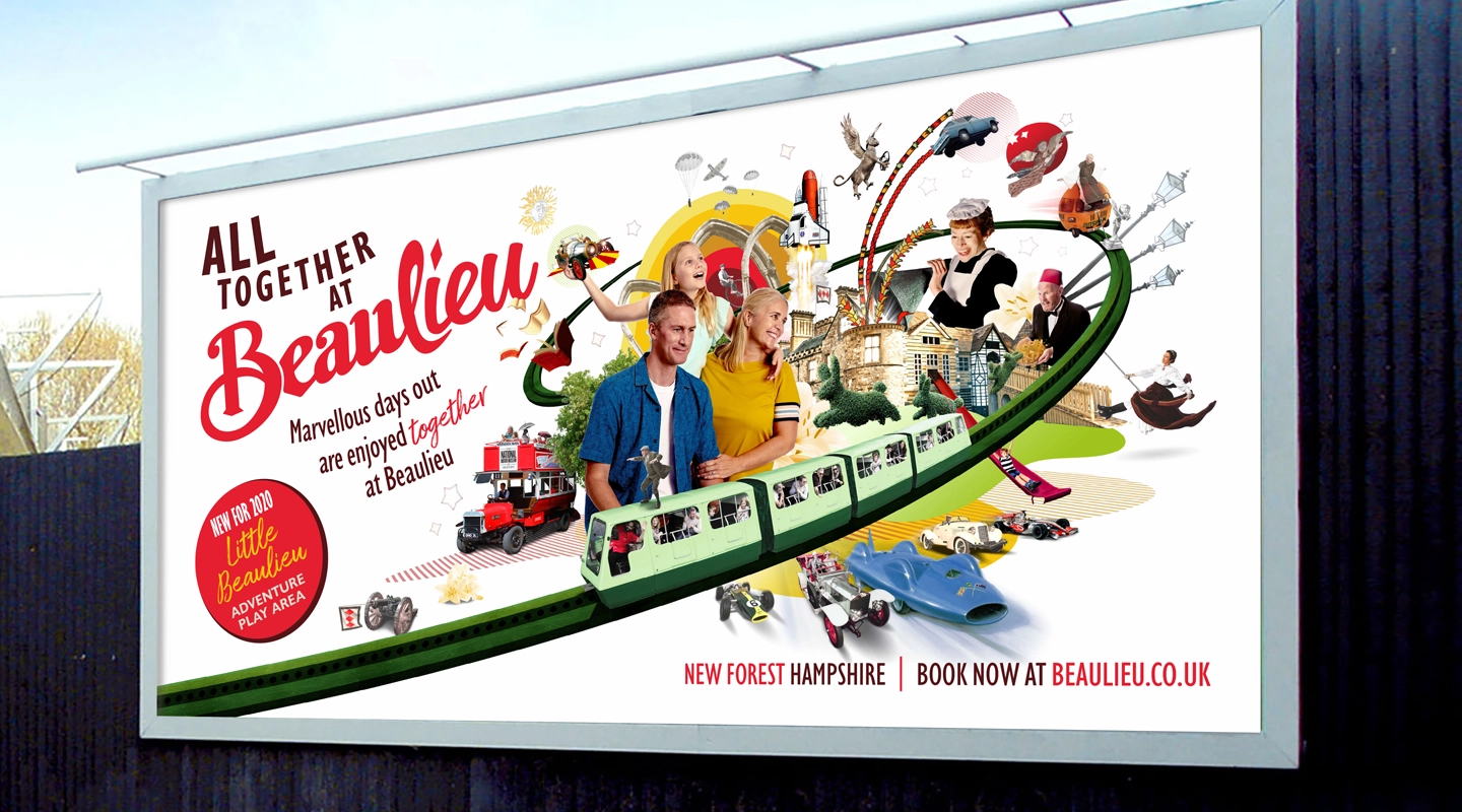
5. Beaulieu

when everything is the hero, build a new world

The challenge

Beaulieu is not one attraction. It is the National Motor Museum, Palace House, the Abbey Ruins, World of Top Gear, Little Beaulieu, the Monorail, gardens, characters and plenty more, all together in one place.

The campaign needed to communicate that variety while appealing to families with different ages and interests, but focusing on one attraction would undersell the day out and showing everything separately risked producing a visual checklist. We needed to bring all of Beaulieu together in a single creative idea without making it feel crammed, predictable or like a collection of unrelated selling points.

How we overcame it

We leaned into the unusual mix. Using bespoke photography, we created an abstract montage that combined Beaulieu’s attractions in a charming, energetic and slightly surreal world. Rather than treating the different experiences as separate messages, the campaign showed them interacting as part of one distinctive day out.

The strangeness was important because it gave people something to notice, explore and remember, while the montage was built to adapt across billboards, brochures, digital banners, emails and web applications without losing its impact.

What we learned

When a client has a lot to say, the answer is not necessarily to say less. Sometimes the answer is to find one creative device capable of holding everything together, making the variety itself the idea rather than the problem.

The trick is creating a clear visual world with enough structure to prevent it becoming a collage of unrelated stuff. The lesson: when you can’t choose one hero, create a stage big enough for all of them.

The bit we carry forward

Every one of these projects presented a different problem: too many colours, too many attractions, too many audiences, a collection too broad to sum up with one object, or a place that needed to feel both familiar and completely new. There was no template that could solve all five, but what carried across them was the importance of finding the useful constraint—the rule, observation or central thought that gives the creativity somewhere to go.

A brand system should make difficult decisions easier. A campaign idea should organise information, not just decorate it. And a design challenge is usually a sign that we have not found the simplest version of the idea yet. That is why we don’t run from awkward briefs. They are normally where the good stuff is hiding.

Got a creative challenge that won’t behave?

Bring it our way and we’ll help make sense of it.